4. Globe
Globe Brand is an Australian skate shoe company my work for them varies. I create a multitude things such as promotional items, web assets, web page designs, shoe bed designs, skateboard graphics, and catalog work. Most web and catalog work falls under strict brand guidelines. Though promotional items I create have a bit more leniency, they have to be aligned with the brand. Work at Globe tends to merges both the disciplines of graphic design and illustration. This is because of the very same nature of the industry.


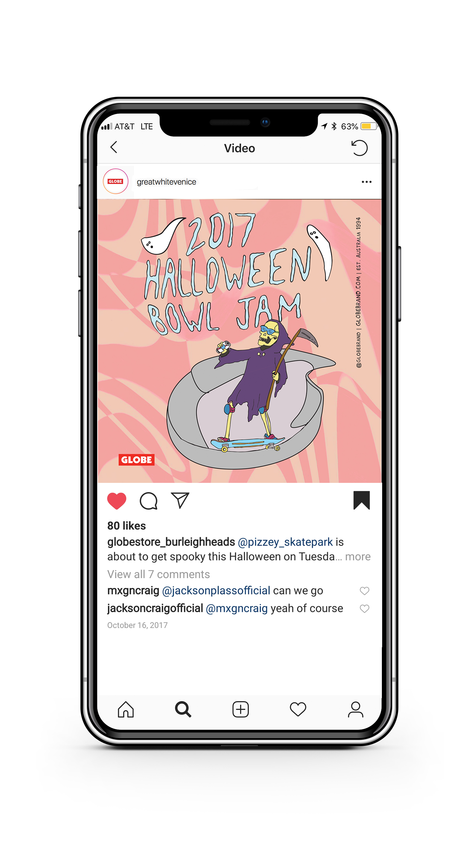
The Pizzey Skatepark Halloween Bowl Jam is a contest that is held yearly in Gold Coast, Queensland, Australia. I was given the job to create an identity for this event. I wanted to make a flyer that evoked the idea of Halloween without the usage of the typical blood and gore. This was designed to try to feel welcoming and fun for all skateboarders. I created this mixed checkered pattern in a soft pink color. This acted as part of the unify elements to the branding of the event. different portions of this grim reaper were used for other promotional elements. Therefore it was created so the reaper could exist without a body if the dimensions only allowed the usage of the head. The typeface was also custom made. Each letter form was created by hand in a staggered pattern. This gave it a feeling of a “ghostly”typeface while complementing the background elements.

This poster was designed for Globe’s beach day. The beach day poster series occurs every September as part of a yearly set of company events. I created this poster using stamps, and textures. A custom hand made typeface was created for this. the typeface is based off of Fritz Quadarta. I then set the informational type and logos digitally. I tried to retain this hand made quality.


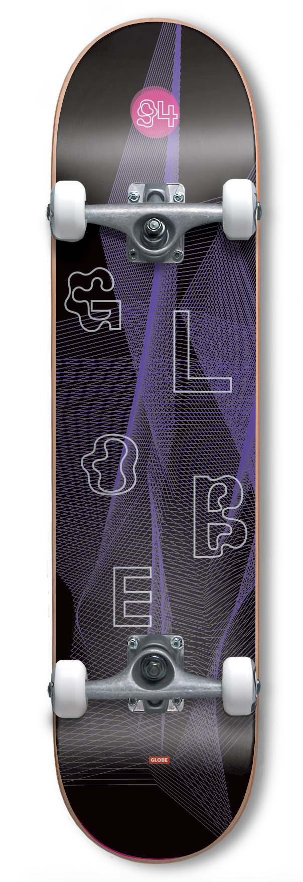
This was a one off design proposal for Globe’s logo board collection that is know as the G1 board series. The G1 features the iconic red bar logo at the tail of the board. The graphics typically included a blocked out color pallets or a patterned texture with an accompanied version of the brand’s name in a complementary typeface. For this specific board I was inspired by the black light graphics created in the psychedelic music scene. I simplified this idea and created a texture. This neon purple wave texture with black mimicked this style of illustration. The typeface was selected to evoke the “wavy” textural line idea. It allowed for the board graphic to keep the psychedelic features of the black light graphics while retaining sense of modernity.
